Quick answer: Good landing page design focuses one page on one offer and one action. Match the headline to the ad or search that brought the visitor, explain the benefit clearly, show proof such as reviews and credentials, keep the form short, load fast on phones and remove distractions like full navigation menus.
You can pay for clicks, earn them through search or send them from email, but if the page they land on is confusing, slow or generic, most of that traffic leaves without contacting you. That is why landing page design matters so much for small businesses running ads or campaigns. A landing page is not a smaller homepage. It is a focused page built to turn one type of visitor into one type of lead. This guide explains what makes a high-converting landing page, the layout that works, how to write the copy, how to design the form, and the mistakes that quietly waste ad budgets.
Key Takeaways
- A landing page has one goal: one offer, one audience, one call to action.
- The headline must match the ad, email or search that brought the visitor.
- Proof near the form, such as reviews, credentials and project photos, reduces hesitation.
- Short forms with clear labels convert better than long ones. Ask only for what you need now.
- Speed and mobile usability are part of landing page design, not an afterthought.
What is landing page design?
Landing page design is the planning, writing and layout of a standalone web page built to convert visitors from a specific source into leads or customers. Unlike a homepage, which serves many audiences, a landing page serves one audience with one offer and one action.
Common examples for small businesses:
- A “Free Roof Inspection” page for a Google Ads campaign.
- A “Free Case Review” page for a law firm’s practice area ads.
- A “Book Your First Visit” page for a medical or dental practice.
- A downloadable guide or checklist offered in exchange for an email address.
What makes a high-converting landing page?
A high-converting landing page makes it instantly clear that the visitor is in the right place, explains why the offer is worth acting on, removes doubt with proof and makes the action easy. Everything on the page should support that single goal.
The core principles:
- Message match. The headline repeats the promise of the ad or link the visitor clicked.
- One offer, one action. No competing buttons, no menu that leads elsewhere.
- Benefits before features. Say what the visitor gets, then how you deliver it.
- Proof at the point of decision. Reviews, credentials and examples near the form.
- Low friction. Short forms, click-to-call on mobile and fast loading.
Relevance matters for paid traffic too. Google Ads describes landing page experience as how relevant and useful your landing page is to people who click your ad, and it is one of the factors in Google Ads Quality Score.
What is the best landing page layout?
The best landing page layout follows the order of a visitor’s questions: Am I in the right place? What do I get? Can I trust you? What do I do next? Answer each one in turn, top to bottom.
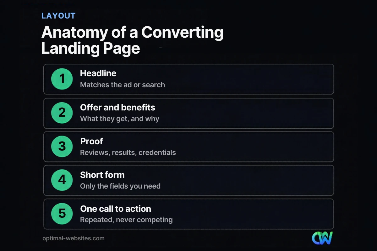
Above the fold
- A headline that matches the ad or search.
- A one-line subheadline with the main benefit.
- A short form or a prominent call-to-action button.
- A phone number for visitors who prefer to call.
- A relevant image: your team, your work or the result.
Below the fold
- Three to five benefits, each with a short explanation.
- How it works in three steps.
- Reviews and credentials.
- Frequently asked questions that address objections.
- The same call to action repeated near the bottom.
What to leave out
- The full site navigation menu.
- Links to your blog, social profiles or unrelated services.
- Pop-ups that cover the form on mobile.
- Auto-playing videos with sound.
How do you write landing page copy that converts?
Write landing page copy that converts by speaking to one audience about one problem in plain language, leading with the outcome they want and backing every claim with something specific. Short, clear sentences beat clever ones.
A simple copy framework:
- Headline: the outcome or offer, matching the ad. “Free roof inspection in New Castle County, booked in 24 hours.”
- Subheadline: who it is for and why now.
- Benefits: what changes for the customer, in their words.
- Proof: specific reviews, years in business, licenses, project photos.
- Objection handling: pricing transparency, guarantees, what happens after they submit.
- Call to action: a verb that describes the result, such as “Get My Free Estimate,” rather than “Submit.”
How should a landing page form be designed?
A landing page form should ask only for the information you need to follow up, use clear labels and fit comfortably on a phone screen. Every extra field gives visitors another reason to stop.
Nielsen Norman Group’s form usability research recommends minimizing the number of fields, using a single-column layout, keeping labels visible instead of relying on placeholder text, clearly marking required and optional fields, and showing specific error messages. In practice:
- Start with name, phone or email, and one qualifying question.
- Use the right keyboard on mobile for phone and email fields.
- Explain what happens next, such as “We will call you within one business day.”
- Send an instant confirmation email and alert your team immediately.
For more ways to turn visitors into leads across your whole site, see our 12 fixes to get more leads from your website.
Why does landing page speed matter?
Landing page speed matters because visitors from ads and social media decide quickly whether to stay, and a slow page loses them before they read the offer. Every visitor who leaves before the page loads is a click you paid for without a chance to convert.
Use Google’s Core Web Vitals as your targets: a Largest Contentful Paint of 2.5 seconds or less, an Interaction to Next Paint of 200 milliseconds or less and a Cumulative Layout Shift of 0.1 or less. For landing pages, that usually means:
- Compressing the hero image and avoiding sliders.
- Loading only the scripts the page needs.
- Reserving space for the form so it does not jump as the page loads.
- Testing on a real phone over a cellular connection.
What are the most common landing page mistakes?
The most common landing page mistakes are sending ad traffic to the homepage, mismatching the headline and the ad, asking for too much information and burying the call to action. Each one reduces conversions without being obvious.
| Mistake | Why it hurts | Fix |
|---|---|---|
| Sending ads to the homepage | Visitors must hunt for the offer | Build a dedicated page per campaign |
| Headline does not match the ad | Visitors doubt they are in the right place | Repeat the ad’s promise in the headline |
| Long forms | Friction causes drop-off | Ask only for essentials |
| Multiple competing offers | Choice paralysis | One offer, one call to action |
| No proof | Visitors hesitate to share details | Add reviews and credentials near the form |
| Slow mobile loading | Paid clicks leave before seeing the page | Optimize images and scripts |
| No tracking | You cannot tell what works | Track form submissions and calls |
How do you test and improve a landing page?
Test and improve a landing page by tracking conversions, changing one element at a time and comparing results over a meaningful number of visitors. Small businesses do not need complex tools to start.
- Track form submissions and phone calls as conversions.
- Watch the conversion rate for each traffic source.
- Change one element at a time: the headline, the offer, the form length or the hero image.
- Run each version long enough to collect a reasonable number of conversions before deciding.
- Keep a simple log of what you changed and what happened.
Usability basics apply here as on the rest of your site; our website user experience tips cover readability, layout and navigation.
Landing page examples: what strong pages have in common
Strong landing page examples across industries share the same bones regardless of design style: a specific headline, a visible form or button, proof near the action, a short “how it works” section and no navigation leaks. A roofing inspection page, a law firm case review page and a medical booking page can look completely different and still follow this structure.
At Optimal Websites, a WordPress web design agency based in Delaware, we build landing pages in Elementor Pro using the same brand styles as the main site, so campaign pages stay consistent and fast to launch. Clients can duplicate a proven page for a new service or town and edit the text themselves.
How Optimal Websites Can Help
If your ads or campaigns are getting clicks but few leads, the landing page is often the fix. Our lead generation services include landing page planning, copy, design, form setup and conversion tracking on WordPress. For budgeting, our guide to what a website costs explains how landing pages fit into a broader website plan.
Frequently Asked Questions
What is the difference between a landing page and a homepage?
A homepage introduces your whole business to many audiences and links to every part of your site. A landing page focuses on one offer for one audience, usually from a specific ad, email or campaign, and asks for one action. Good landing page design removes distractions, including the main navigation, so visitors focus on that action.
How long should a landing page be?
A landing page should be as long as it takes to answer the visitor’s questions and no longer. Simple, low-commitment offers like a free inspection can work with a short page. Higher-commitment offers usually need more explanation, proof and FAQs. Keep the main call to action visible near the top and repeat it lower down.
What should a high-converting landing page include?
A high-converting landing page should include a headline that matches the traffic source, a clear benefit-focused subheadline, a short form or call-to-action button, proof such as reviews and credentials, a brief explanation of how it works, answers to common objections and the same call to action repeated near the bottom of the page.
How many form fields should a landing page have?
Use as few form fields as you need to follow up well. For most service businesses that means name, phone or email and one qualifying question. Usability research recommends minimizing fields and keeping a single-column layout. Gather extra details on the first call rather than asking for them upfront.
Should a landing page have navigation?
Usually not. Landing page best practices recommend removing the main navigation menu so visitors focus on the single offer and call to action. Keep a small logo, your phone number and essential legal links such as the privacy policy. Every extra link is another way for paid traffic to leave without converting.
Do I need a separate landing page for each ad campaign?
Ideally, yes. Each campaign or ad group targeting a different service or audience should point to a landing page whose headline and content match that ad. Message match improves relevance for visitors and supports landing page experience in Google Ads. Duplicating a proven template makes this manageable.
Ready to Get Started?
Want landing pages that turn clicks into calls? Request a free quote or call (302) 554-9497 to talk about your next campaign.