Last updated: October 15, 2026
Quick answer: A mobile-friendly website adapts to any screen, loads fast on a phone, and shows the same content as its desktop version. Google indexes the mobile version of your site first, so build with responsive design, pass Core Web Vitals, use readable text and large tap targets, and test with Lighthouse or PageSpeed Insights.
Most of your customers will meet your business on a phone. They search for a roofer after a storm or a lawyer on a lunch break. If your site is slow or cramped on a small screen, they call the next result. A mobile-friendly website now decides whether Google ranks you and whether visitors become leads. This guide explains how Google evaluates mobile sites today, how to make a website mobile friendly step by step, and includes a checklist you can run on your own site this week.
Key Takeaways
- Google now uses the mobile version of your site for indexing and ranking. If content is missing on mobile, Google does not see it.
- Responsive design is Google’s recommended setup because it serves one set of URLs and content to every device.
- Google retired its standalone Mobile-Friendly Test on December 1, 2023. Use Lighthouse, PageSpeed Insights, and Chrome DevTools device mode instead.
- Speed, readable text, large tap targets, and easy contact options matter as much as layout.
- A short checklist and a few free tools can reveal most mobile problems in under an hour.
What Is a Mobile-Friendly Website?
A mobile-friendly website is a site that is easy to read, navigate, and use on a smartphone without zooming, pinching, or horizontal scrolling. It loads quickly on a cellular connection and gives mobile visitors the same information and actions as desktop visitors.
Mobile optimization is the ongoing work of tuning layout, speed, content, and forms for small screens and touch input. Every new page, plugin, or image can help or hurt it.
Why mobile optimization matters for revenue
Phones are how most Americans get online on the go. According to Pew Research Center’s mobile fact sheet (November 2025), 91% of U.S. adults own a smartphone. For a local service business, that means the first impression usually happens on a 6-inch screen.
Mobile visitors usually want one thing fast: a phone number, hours, or a quote form. When those are buried, you lose the lead. Our article on the hidden costs of an outdated website covers how much those lost visits can add up.
What Is Mobile-First Indexing, and Is It Finished?
Mobile-first indexing means Google primarily crawls, indexes, and ranks the mobile version of your pages. Yes, it is finished: Google announced that mobile-first indexing was complete on October 31, 2023.
The shift took years. Google launched its mobile-friendly update in 2015, began mobile-first indexing in 2016, and moved deadlines several times (including a planned March 2021 cutoff) before finishing in 2023. Only a very small set of sites that do not work on mobile at all are still crawled with the legacy desktop crawler.
In short, your mobile site is your site in Google’s eyes. Content hidden or missing on phones may not count toward rankings.
What Google checks on your mobile version
Google’s mobile-first indexing best practices include these points:
- Same primary content and headings. Mobile pages should match desktop. Tabs and accordions are fine.
- Same robots meta tags. A stray `noindex` or `nofollow` on mobile can keep pages or links out of Google.
- No interaction-only lazy loading. Google does not swipe, click, or type, so content that loads only after a tap may never be seen.
- Don’t block key resources. Blocking CSS, JavaScript, or images in robots.txt can stop Google from rendering your pages correctly.
- Equivalent images and structured data. Keep the same alt text, image URLs, and structured data on mobile.
Why Does Google Recommend Responsive Design?
Responsive design is a layout approach where one page uses flexible grids and CSS to rearrange itself for any screen size. Google recommends it because it is the easiest pattern to implement and maintain, and it avoids most mobile-first indexing problems.
There are three common ways to serve mobile visitors:
| Setup | How it works | Mobile-first risk | Our take |
|---|---|---|---|
| Responsive design | One URL and one HTML, layout adapts with CSS | Low | Best choice for almost every business |
| Dynamic serving | One URL, different HTML per device | Medium | Easy to let mobile content drift |
| Separate mobile URLs (m-dot) | Different URLs such as m.example.com | High | Hard to maintain; avoid for new builds |
With responsive design there is nothing to keep in sync, which is why every site we build is responsive from the start.
How Do You Make a Website Mobile Friendly? (Step by Step)
You make a website mobile friendly by starting with a responsive layout, then improving speed, readability, touch usability, and content parity, and finally testing on real devices. Here is the order we follow:
- Use a responsive theme or builder. On WordPress, a lightweight theme and modern page builder handle most layout work. Confirm the page includes the viewport meta tag: `<meta name=”viewport” content=”width=device-width, initial-scale=1″>`.
- Design for the smallest screen first. Put what phone visitors need most (services, proof, contact) near the top, then expand for larger screens.
- Keep content equal across devices. Use accordions instead of hiding text or images on mobile.
- Make text readable. Use about 16px body text, comfortable line height, and strong contrast.
- Size tap targets for thumbs. Google’s web.dev guidance suggests touch targets of about 48 by 48 device-independent pixels.
- Speed up the page. Compress images, serve WebP, limit heavy scripts and plugins, and use caching. Our step-by-step guide to improving page speed goes deeper.
- Avoid intrusive pop-ups. Full-screen interstitials work against Google’s page experience guidance.
- Simplify navigation and forms. Add a click-to-call button and short forms with the right input types (tel, email).
- Check images and video. Use sharp images with descriptive alt text, and keep videos easy to find on mobile.
- Test, fix, and retest. Use the tools below, then check a real iPhone and Android phone.
Which Tools Can Test a Mobile-Friendly Website Now?
Use Lighthouse, PageSpeed Insights, and Chrome DevTools device mode. Google retired the Mobile-Friendly Test, the Mobile-Friendly Test API, and the Search Console Mobile Usability report starting December 1, 2023, and pointed site owners to Lighthouse instead. Google was clear that mobile usability still matters as part of its page experience guidance.
- PageSpeed Insights. Shows real-user Core Web Vitals data (when available) plus a Lighthouse lab report.
- Lighthouse. Built into Chrome DevTools, it audits performance, accessibility, best practices, and SEO.
- Chrome DevTools device mode. Simulates phone screens and throttles CPU and network. Confirm results on a real phone.
- Google Search Console. The Core Web Vitals report and URL Inspection tool show how real users and Google see your pages.
The Core Web Vitals targets to aim for
Core Web Vitals are Google’s metrics for real-world loading, responsiveness, and visual stability. Per Google’s web.dev guidance, good scores are:
- Largest Contentful Paint (LCP): 2.5 seconds or less.
- Interaction to Next Paint (INP): 200 milliseconds or less. INP replaced First Input Delay in March 2024.
- Cumulative Layout Shift (CLS): 0.1 or less.
Measure at the 75th percentile of page loads, separately for mobile and desktop.
Mobile-Friendly Website Checklist
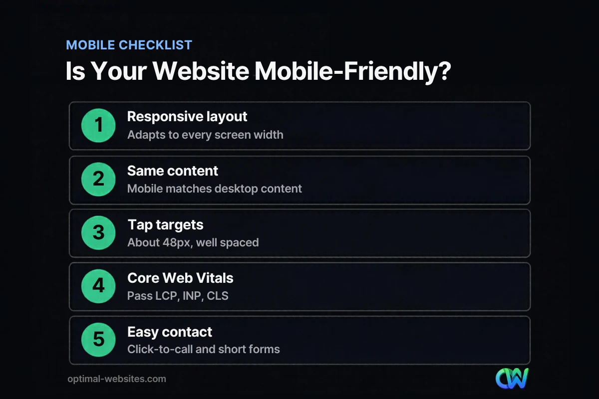
Run through this checklist on your homepage, your top service page, and your contact page. If you answer “no” to any item, that is your next fix.
- [ ] The layout adapts to phone, tablet, and desktop with no horizontal scrolling.
- [ ] The viewport meta tag is present.
- [ ] Mobile pages show the same text, headings, and images as desktop.
- [ ] Body text is about 16px or larger and easy to read without zooming.
- [ ] Buttons and links are large and spaced apart for thumbs.
- [ ] The phone number is a tap-to-call link, and the main call to action is visible without much scrolling.
- [ ] Forms are short and use the right input types.
- [ ] No full-screen pop-up blocks content when the page loads.
- [ ] Images are compressed, sized correctly, and have descriptive alt text.
- [ ] Mobile Core Web Vitals pass in PageSpeed Insights or Search Console.
- [ ] Robots.txt does not block CSS, JavaScript, or images.
- [ ] The site has been tested on at least one real iPhone and one real Android phone.
What Does Mobile-First Design Look Like in Practice?
Mobile-first design means planning every page for a phone visitor before scaling up to desktop.
At Optimal Websites, a WordPress web design agency we build sites in WordPress with Elementor Pro and adjust each section at the mobile breakpoint, not just the desktop view. For contractors, roofing companies, and construction firms like the ones in our portfolio, that usually means a clear headline, a tap-to-call button, the main services, and trust signals within the first screen or two. For law firms, it means practice areas that are easy to scan and a consultation form that takes seconds on a phone.
We also keep pages lean, with fewer plugins and optimized images, because a beautiful layout that loads slowly still loses the visitor. For the bigger picture, read why website optimization matters.
How Optimal Websites Can Help
If your site was built several years ago, it may look fine on a laptop but struggle on a phone. Our web design and development services focus on fast, mobile-first, conversion-focused WordPress sites, and our website speed optimization work helps existing sites pass Core Web Vitals.
Most projects launch in 2–4 weeks, and you get video training so your team can edit the site without calling a developer. You can compare our website packages and pricing, with Starter projects starting at $999.
Frequently Asked Questions
How do I know if my website is mobile friendly?
Open your site on a phone and check whether you can read and tap everything without zooming. Then run the page through PageSpeed Insights or Lighthouse, which flag mobile performance, accessibility, and SEO issues. Chrome DevTools device mode lets you preview different screen sizes. Finally, review the Core Web Vitals report in Google Search Console to see how real mobile visitors experience your pages.
Is the Google Mobile-Friendly Test still available?
No. Google retired the Mobile-Friendly Test tool, its API, and the Search Console Mobile Usability report starting December 1, 2023. Google recommends Lighthouse instead, which is built into Chrome and also powers the lab results in PageSpeed Insights. Google stated that mobile usability remains part of its page experience guidance, so the retirement does not mean mobile optimization matters less.
Does mobile-first indexing affect my rankings?
Yes. With mobile-first indexing, Google uses the mobile version of your pages for indexing and ranking. Content, headings, or structured data that appear only on desktop may not be considered. If your mobile site is a stripped-down version of your desktop site, you could rank lower than your content deserves. A responsive design that shows the same content everywhere avoids this problem.
What is the difference between responsive design and a mobile-friendly website?
Responsive design is a technique: one page whose layout adapts to any screen using flexible grids and CSS. A mobile-friendly website is the outcome: a site that is easy to use on a phone. Responsive design is the most reliable way to get there, and it is what Google recommends, but a responsive site can still fail if it loads slowly or has tiny buttons.
How much does it cost to make a website mobile friendly?
Cost depends on whether your current site can be fixed or needs a rebuild. Small fixes like compressing images or adjusting font sizes can be inexpensive, while an older non-responsive site usually needs a redesign. At Optimal Websites, new WordPress website packages start at $999 for Starter, $1,499 for Professional, and $1,999 for Advanced Custom, and quotes are free.
Is WordPress good for mobile optimization?
Yes, when it is built well. Most modern WordPress themes are responsive, and page builders like Elementor Pro let you adjust layouts, spacing, and font sizes for mobile and tablet breakpoints. The bigger risks are heavy themes, too many plugins, and unoptimized images, which slow mobile load times. A lean build with caching and image optimization keeps a WordPress site fast on phones.
How often should I test my site on mobile?
Test whenever you launch a new page, change your theme, or add a plugin, and do a full review at least every few months. Check Google Search Console’s Core Web Vitals report monthly, since it reflects real visitors. Mobile problems often creep in slowly through new images, pop-ups, or scripts, so regular checks catch issues before they cost you leads.
Ready to Get Started?
Want a mobile-friendly website that loads fast and turns phone visitors into calls? Request your free quote or call us at (302) 554-9497 to talk through your site.