Last updated: October 15, 2026
Quick answer: Homepage design best practices come down to four jobs: say clearly who you are and who you help, prove it with social proof, route visitors to your main services, and give one obvious next step. Put the essentials above the fold, keep the page fast on mobile, and cut anything that does not support a decision.
Your homepage is usually the first page a new customer sees, and it has a few seconds to answer three questions: what do you do, can I trust you, and what should I do next? When it fails, visitors leave and call a competitor instead. That is lost revenue you never see in a report. This guide covers homepage design best practices we use when building WordPress sites for small and mid-sized businesses: an above-the-fold checklist, a section-by-section layout table, examples by industry and the mistakes that quietly cost leads. Use it to audit your current homepage or brief a designer on a new one.
Key Takeaways
- Lead with a clear identity statement that names what you do and who you serve, in plain words.
- Keep the most important content above the fold, where visitors spend most of their viewing time.
- Use real social proof (reviews, client logos, awards) near the top, not buried in the footer.
- Give every homepage one primary call to action and repeat it as visitors scroll.
- Design mobile-first and keep the page fast, since Google indexes the mobile version of your site.
What Are Homepage Design Best Practices?
Homepage design best practices are the layout, content and technical choices that help a first-time visitor understand your business quickly and take a next step. They are less about trendy visuals and more about clarity, trust and speed.
A homepage is not a brochure that lists everything you do. It is a routing page. Some visitors are ready to call today. Others want to research your services, check reviews or look at past work first. A good homepage serves both groups without making either one hunt.
Every industry needs its own approach, but the same priorities apply to almost every B2B and B2C business:
- Identity: state who you are and who you help.
- Proof: show that other people trust you.
- Paths: point visitors to your main services or product categories.
- Action: tell them exactly what to do next.
If you want to go deeper on the broader experience across your whole site, our guide to website user experience tips picks up where this one ends.
What Should Be Above the Fold on a Homepage?
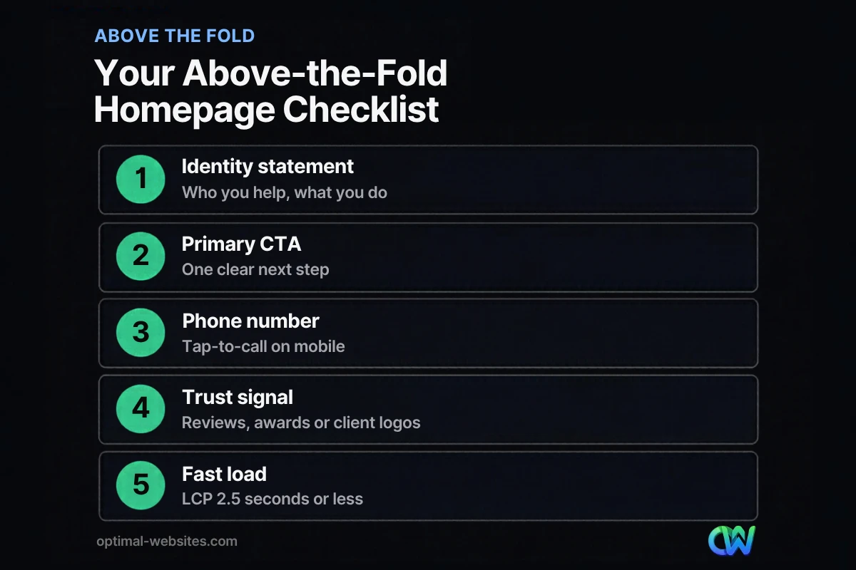
Above the fold should hold your identity statement, one primary call to action, a phone number or contact option, a trust signal and a relevant image. “Above the fold” means the part of the page a visitor sees before scrolling, on whatever screen they are using.
This space matters. In Nielsen Norman Group eyetracking research on scrolling (2018), users spent about 57% of their page-viewing time above the fold, and 74% within the first two screenfuls. People do scroll, but they decide whether to keep going based on what they see first.
Above-the-fold checklist
- [ ] Identity statement: one headline that says what you do and for whom. “Commercial roofing for Delaware businesses” beats “Excellence in every project.”
- [ ] Supporting line: one sentence on your main benefit or service area.
- [ ] Primary CTA button: “Get a Free Quote,” “Schedule a Consultation” or “Book a Call.” Pick one.
- [ ] Phone number: visible in the header and tap-to-call on mobile.
- [ ] Trust signal: star rating, review count you can link to, an award badge or recognizable client logos.
- [ ] Relevant hero image: your team, your work or your product. Avoid generic stock photos that could belong to anyone.
- [ ] Simple navigation: five to seven top-level items, with services grouped logically.
- [ ] Fast loading: the hero image and headline should appear quickly. Skip auto-rotating sliders; most visitors only see the first slide.
On mobile, the fold is much shorter, so prioritize ruthlessly. The headline, a short supporting line and the CTA button should all be visible on a phone without scrolling.
What Sections Should a Homepage Have?
Most effective small business homepages follow the same order: hero, social proof, services, why choose you, process, featured work, FAQ and a closing CTA. The order mirrors how people decide: understand, trust, explore, then act.
Here is the section-by-section layout we start from on most builds, then adjust for the industry.
| Section | Purpose | What to include | Common mistake |
|---|---|---|---|
| Header | Navigation and contact | Logo, 5–7 menu items, phone, CTA button | Overloaded menus with 12+ links |
| Hero | Identity and first action | Clear headline, one supporting line, primary CTA, real image | Vague slogans and auto-rotating sliders |
| Social proof strip | Instant credibility | Review rating, client logos, awards, certifications | Unverifiable or anonymous testimonials |
| Services or categories | Route visitors deeper | 3–6 cards linking to service or category pages | Listing every service with no links |
| Why choose us | Differentiate | 3–4 specific reasons (local, licensed, fast turnaround) | Generic claims like “quality service” |
| Process | Reduce uncertainty | 3–4 numbered steps from first call to finished job | Skipping it, so buyers fear the unknown |
| Featured work | Show, not tell | Project photos, short descriptions, link to portfolio | Outdated projects or broken galleries |
| Testimonials | Reinforce trust | 2–3 named reviews with context | Walls of text with no names |
| FAQ | Handle objections | 4–6 real questions customers ask | Questions nobody actually asks |
| Closing CTA | Capture ready visitors | Repeat the main CTA, phone and short form | Ending with a footer and no next step |
| Footer | Utility and local signals | Address, hours, service areas, key links | Missing contact details |
You do not need every row. A one-person consultancy might skip the process section. An online store might replace “services” with three or four top product categories. The goal is that each section earns its place by helping someone decide.
Clarify your “buckets”
We call the services or categories section your buckets. If you sell products, your buckets might be your three or four best-selling categories. If you sell services, they are your top three to six offerings. Each bucket should be a card with a short description and a link to a dedicated page, so researchers have a launchpad deeper into the site while ready buyers head straight to the CTA.
How Do You Build Trust on a Homepage?
You build trust on a homepage with external proof: reviews, client logos, awards and real project photos. People discount what a company says about itself and pay attention to what others say about it.
Any business can call itself the best. Social proof is different because it comes from outside your company. Here are the main types and where they work best.
- Reviews and testimonials: strongest when they come from third-party platforms such as Google or industry directories, include a name, and mention a specific service.
- Client logos and case studies: especially useful for B2B companies. Recognizable clients signal that other businesses already vetted you.
- Awards, associations and certifications: licenses, trade memberships and recognized awards add credibility quickly. Use a few, not a wall of badges.
- Real photos: your team, your trucks, your job sites. Real images build more trust than polished stock.
Only use proof you can back up. Invented reviews or borrowed logos can damage trust permanently and create legal risk.
How Many Calls to Action Should a Homepage Have?
A homepage should have one primary call to action, repeated in a few places, plus one softer secondary option for visitors who are not ready. Multiple competing CTAs split attention and lower the chance anyone acts.
Tell the user what to do next. It sounds obvious, but many homepages end with a footer and nothing else. Your visitors need an easy way to raise their hand and say, “I like what I see.”
Good CTA patterns we see work across industries:
- A roofing company puts its phone number directly above a “Request a Free Inspection” button.
- A law firm offers a “Free Case Review” form with three short fields.
- A counseling practice links to a “Book a 15-Minute Intro Call” scheduler.
- A software company asks visitors to “Schedule a Quick Demo.”
Place the primary CTA in the header, in the hero, after the services section and at the bottom of the page. For more ways to turn visits into inquiries, see our guide to getting more leads from your website.
What Do Good Homepages Look Like by Industry?
Good homepages look different by industry because buyers ask different questions. A homeowner with a leaking roof wants speed and a phone number; someone hiring a lawyer wants credentials and reassurance.
Below are the priorities we use when planning homepages for the industries we build for most often. These are design patterns, not performance claims.
Contractors and roofing
Roofing and contracting clients, such as PCS Roofs and E & S Construction Engineers in our portfolio, serve buyers who often have an urgent problem. Put the phone number and a quote button above the fold, list service areas clearly, show real project photos and display licenses, insurance and warranties near the top.
Construction and commercial services
For firms like Care Facilities Construction, buyers are often project managers or owners comparing bids. Lead with project types and sectors served, show a featured projects gallery and include a simple process section that explains how a project moves from bid to completion.
Law firms
Law firm homepages, like those for Wright Ryon & Maher and F. J. Collins Law, should state practice areas in plain language, introduce attorneys with photos, and offer a low-pressure next step such as a free consultation. Reassurance and clarity matter more than flashy design.
Healthcare and local service businesses
Patients and local customers want logistics fast: location, hours, insurance or service area, and how to book. For local service clients like Peachtree Corners Services, we keep service areas and contact options front and center. Online booking or a short request form works well here.
Founders and startups
Startups usually need to explain a new idea quickly. Use a sharp one-line value proposition, a short “how it works” section, and a single CTA such as a demo, waitlist or free trial.
Why Do Mobile Design and Speed Matter for Your Homepage?
Mobile design and speed matter because many customers will find you on a phone, and Google ranks your site based on its mobile version. A slow or cramped mobile homepage loses visitors before they read your headline.
Google states that it uses the mobile version of your content, crawled with a smartphone agent, for indexing and ranking. If your mobile homepage hides content or loads poorly, that is the version Google evaluates.
Speed is measured with Core Web Vitals. According to Google’s Core Web Vitals thresholds on web.dev, a good experience means:
- Largest Contentful Paint (LCP): 2.5 seconds or less. LCP is the time it takes the largest visible element, usually the hero image or headline, to load.
- Interaction to Next Paint (INP): 200 milliseconds or less. INP measures how quickly the page responds when someone taps or clicks. It replaced First Input Delay in March 2024.
- Cumulative Layout Shift (CLS): 0.1 or less. CLS measures how much the layout jumps around while loading.
The homepage hero is often the biggest speed problem. Large uncompressed images, autoplay videos and sliders all slow LCP. Check your homepage in PageSpeed Insights and Google Search Console, and read our guides on how to improve website speed and building a mobile-friendly website.
In our own builds, we design the mobile homepage first in Elementor Pro, then expand it for desktop. That forces decisions about what truly belongs at the top.
How Optimal Websites Can Help
Optimal Websites, a WordPress web design agency based in Delaware, builds fast, mobile-first, conversion-focused sites with Elementor Pro for contractors, law firms, healthcare providers, local service businesses and startups. Every homepage we plan follows the priorities in this guide: clear identity, real proof, simple paths and one obvious next step.
Explore our WordPress web design and development services to see how we work. You can also review our website package pricing: Starter starts at $999, Professional at $1,499 and Advanced Custom at $1,999, and most projects launch in 2–4 weeks. Every client gets video tutorials so you can update your own homepage after launch.
Frequently Asked Questions
What makes a good homepage?
A good homepage clearly states what your business does and who it serves, shows proof that others trust you, routes visitors to your main services and gives one obvious next step. It also loads quickly on mobile. Following these homepage design best practices helps first-time visitors understand your value in seconds instead of leaving to search for a competitor.
What should be above the fold on a homepage?
Above the fold should include a clear headline describing what you do, a short supporting line, one primary call-to-action button, your phone number and a trust signal such as reviews or awards. Add a relevant image of your real work or team. On mobile, make sure the headline and CTA are visible without scrolling.
How long should a homepage be?
A homepage should be long enough to answer a visitor’s key questions and no longer. For most small businesses, that means around six to ten sections: hero, social proof, services, why choose you, process, featured work, testimonials, FAQ and a closing CTA. Visitors do scroll when the content is useful and well organized.
How many calls to action should a homepage have?
A homepage should have one primary call to action, such as “Get a Free Quote,” repeated in the header, hero, mid-page and bottom of the page. You can add one softer secondary option, like “View Our Work,” for visitors who are still researching. Too many different CTAs split attention and reduce action.
What are homepage design best practices for mobile?
Homepage design best practices for mobile include designing the phone layout first, keeping the headline and CTA visible without scrolling, using tap-to-call phone numbers, large buttons and short paragraphs. Compress images so the largest element loads in 2.5 seconds or less. Google indexes the mobile version of your site, so mobile quality affects rankings.
How often should I update my homepage?
Review your homepage at least once or twice a year, and any time your services, pricing, service areas or branding change. Refresh testimonials, featured projects and photos so the page never looks stale. Check speed and mobile usability in PageSpeed Insights and Google Search Console after any major update to catch problems early.
Ready to Get Started?
If your homepage is not bringing in calls and inquiries, let’s fix that. Request a free quote or call us at (302) 554-9497 for a free consultation on a homepage built to convert.