Quick answer: To optimize images for web without losing visible quality, resize each image to the largest size it actually displays, compress photos at about 70 to 85 percent quality, convert them to WebP (or AVIF), serve responsive sizes with srcset, and lazy-load only the images below the fold. Keep your main hero image eager-loaded.
Images are usually the heaviest part of a small business website. A single photo straight from a phone or a stock site can weigh more than the rest of the page combined, and it slows everything down on mobile data. Slow pages lose visitors before they ever see your offer, and large images often drag down the Largest Contentful Paint score Google uses in Core Web Vitals. The good news: you can optimize images for web in a few repeatable steps and keep them looking sharp. This guide covers the right dimensions, how much compression is safe, when to use WebP, how responsive images work, how to lazy-load correctly, and how to handle it all in WordPress.
Key Takeaways
- Resizing to the real display size is the biggest single saving; compression and format come next.
- Photos usually look the same at 70 to 85 percent JPEG or WebP quality, at a fraction of the file size.
- WebP lossy images are 25 to 34 percent smaller than comparable JPEGs, according to Google.
- Responsive images (srcset) let phones download smaller files than desktops.
- Lazy-load images below the fold, but never the hero or main image at the top of the page.
Why should you optimize images for web?
You should optimize images because they are often the largest files on a page, and large files slow down loading, especially on phones. Faster pages keep more visitors, and image weight directly affects Core Web Vitals.
The main image at the top of a page is frequently the Largest Contentful Paint element, the moment Google measures as “the main content has loaded.” If that image is a 4 MB photo, LCP suffers no matter how well the rest of the site is built. Our guide to Core Web Vitals explains how LCP is measured and why it matters for rankings and user experience.
Image weight is also about cost and fairness to visitors. Not everyone browses on fast Wi-Fi. A lighter page loads faster on a job site with one bar of signal, which is exactly when a customer may be looking for your phone number.
How do you optimize images for web step by step?
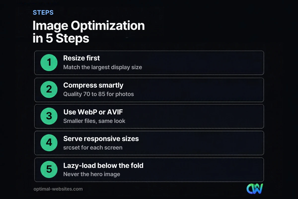
Follow five steps in order: resize, compress, convert, serve responsive sizes and lazy-load the right images. Doing them in this order avoids wasted effort, because compressing an oversized image still leaves you with an oversized image.
Step 1: Resize to the largest display size
Resizing means changing the pixel dimensions of an image to match how large it actually appears on the page. A photo from a modern phone can be 4,000 pixels wide or more, while a full-width hero section rarely needs more than about 2,000 pixels, and a blog image in a content column often needs 1,200 or less.
Practical targets for most small business sites:
| Image type | Suggested max width | Notes |
|---|---|---|
| Full-width hero | 1,920 to 2,400 px | Covers large desktop and high-density screens |
| Content or blog image | 1,200 to 1,600 px | Matches typical content column width |
| Team or headshot photo | 600 to 800 px | Usually displayed small |
| Logo | SVG if possible | Vector files stay sharp at any size |
| Thumbnails and icons | 300 to 400 px, or SVG | Keep them tiny |
Step 2: Compress without visible loss
Image compression reduces file size by removing data the eye barely notices. Lossy compression (used for photos) discards some detail; lossless compression (used for graphics and screenshots) shrinks files without changing any pixels.
For photos, a quality setting around 70 to 85 percent usually looks identical to the original at normal viewing size. Always compare before and after at 100 percent zoom. Faces, gradients and text in images show artifacts first, so check those areas.
Step 3: Convert to WebP or AVIF
WebP is a modern image format developed by Google that supports both lossy and lossless compression plus transparency. According to Google’s WebP documentation, WebP lossless images are 26 percent smaller than PNGs, and WebP lossy images are 25 to 34 percent smaller than comparable JPEG images at equivalent quality.
AVIF can compress even further in many cases, though it takes longer to encode. Both formats are widely supported by current browsers, and WordPress has offered WebP support since version 5.8, with AVIF uploads added in a later release.
Step 4: Serve responsive images
Responsive images are multiple sizes of the same image, listed with the srcset and sizes attributes, so the browser can download the smallest file that still looks sharp on the visitor’s screen. A phone might get an 800-pixel version while a large desktop gets the 1,600-pixel one.
WordPress generates several sizes automatically when you upload an image and adds srcset to images inserted through the editor. Problems usually appear when a theme or page builder outputs images as CSS backgrounds or forces a single “full” size everywhere.
Step 5: Lazy-load images below the fold
Lazy loading delays loading off-screen images until the visitor scrolls near them. The web.dev guide to lazy loading is clear on one rule: do not lazy-load images that are likely to be visible when the page first loads, especially the LCP image. Use loading=”lazy” only for images outside the initial viewport.
This is a common mistake. Many optimization plugins lazy-load everything, including the hero image, which can make LCP worse instead of better.
Which image format should you use?
Use WebP for most photos and graphics, SVG for logos and icons, and keep JPEG or PNG only as fallbacks or when a tool requires them. Here is a quick comparison.
| Format | Best for | Transparency | Typical trade-off |
|---|---|---|---|
| JPEG | Photos (legacy) | No | Universal support, larger than WebP |
| PNG | Screenshots, graphics with sharp edges | Yes | Lossless, often heavy for photos |
| WebP | Photos and graphics | Yes | Smaller files, broad browser support |
| AVIF | Photos where every KB counts | Yes | Smallest files, slower to encode |
| SVG | Logos, icons, simple illustrations | Yes | Vector, tiny and sharp at any size |
How do you optimize images in WordPress?
In WordPress, the easiest approach is to resize images before upload, then let an image optimization plugin handle compression, WebP conversion and lazy loading settings. Check the result with a speed test, because default plugin settings are not always right for your layout.
A practical WordPress image checklist:
- Resize photos to a sensible width before uploading.
- Use one reputable optimization plugin, not several that overlap.
- Turn on WebP (or AVIF) conversion and confirm the converted files are actually served.
- Exclude the hero or first image from lazy loading.
- Set width and height on images so the layout does not jump while loading.
- Avoid huge background images in sliders; a single static hero usually loads faster.
- Clean up unused images and old media sizes occasionally.
If your site still feels sluggish after optimizing images, the cause may be elsewhere. Our guide on fixing a slow WordPress site covers hosting, plugins and caching, and how to improve website speed gives the broader checklist.
What we see on client sites
On the WordPress sites we build and rebuild, oversized images are the most common speed problem we find. Contractors and construction companies, for example, often upload full-resolution project photos straight from the camera, sometimes dozens per gallery page. When we rebuild in Elementor Pro, we set image sizes per section, serve WebP, keep the hero eager-loaded and lazy-load galleries further down the page. The photos still look sharp; they simply stop slowing the site down.
Does image optimization help SEO?
Yes, indirectly and directly. Lighter images improve page speed and Core Web Vitals, which support rankings and user experience, and well-optimized images can also appear in Google Images.
The SEO side of images, such as descriptive file names, alt text and captions, is covered in our separate guide to image SEO. Speed and SEO work together: a fast, well-labeled image helps both visitors and search engines.
How Optimal Websites Can Help
Optimal Websites, a WordPress web design agency based in Delaware, builds fast, mobile-first sites with image optimization handled from day one. If your current site is slow, our website speed optimization service audits images, plugins, hosting and Core Web Vitals, then fixes what is holding the site back, without making your photos look worse.
Frequently Asked Questions
What is the best image size for a website?
There is no single best size. Match each image to the largest size it displays: around 1,920 to 2,400 pixels wide for full-width heroes, 1,200 to 1,600 pixels for content images, and smaller for headshots and thumbnails. Then compress and convert to WebP. Most optimized photos should land well under 300 KB, and many under 150 KB.
How do I optimize images for web without losing quality?
Resize to the real display size, compress photos at about 70 to 85 percent quality, and convert them to WebP. Compare before and after at full size, paying attention to faces, gradients and text. These steps are the safest way to optimize images for web, since visible quality stays the same while file size drops sharply.
Is WebP better than JPEG?
For most websites, yes. Google reports that WebP lossy images are 25 to 34 percent smaller than comparable JPEGs at equivalent quality, and WebP also supports transparency. Current browsers support WebP widely. Keep JPEG only as a fallback or where a platform requires it.
Should I lazy-load all images?
No. Lazy-load images below the fold, but keep the hero image and anything visible on first load eager-loaded. Lazy-loading the main image delays the Largest Contentful Paint and can make Core Web Vitals worse. Many plugins lazy-load everything by default, so check and exclude above-the-fold images.
What is image compression?
Image compression reduces the file size of an image by removing or encoding data more efficiently. Lossy compression discards detail the eye barely notices and suits photos. Lossless compression keeps every pixel and suits logos, screenshots and graphics. Good image compression keeps quality while cutting load time.
Does WordPress optimize images automatically?
Partly. WordPress creates several image sizes on upload, adds srcset for responsive images and adds lazy loading to many images by default. It does not aggressively compress or convert everything to WebP on its own, so most sites benefit from resizing before upload and using a dedicated optimization plugin.
Ready to Get Started?
Want a site that looks great and loads fast on every phone? Request a free quote or call (302) 554-9497 to talk about speeding up your website.