Last updated: October 15, 2026
Quick answer: The best website user experience tips are simple: make navigation obvious, load fast (LCP under 2.5 seconds), write scannable content, design for phones first, cut form and checkout friction, show proof you are trustworthy, and remove pop-ups or autoplay media that interrupt visitors. Then test with real users and keep improving.
You can spend months on ads, social posts and SEO to get people to your site, then lose them in seconds because the menu is confusing or the page crawls on a phone. Every visitor who leaves early is a call, quote request or sale that went to a competitor. These website user experience tips focus on the fixes that matter most for small and mid-sized businesses: how people actually scan pages, what makes them bounce, and how to remove the friction between “just looking” and “contact us.” You will also get a UX checklist and a problem-and-fix table you can use on your own site today.
Key Takeaways
- Visitors decide fast. Nielsen Norman Group found that users often leave pages within 10–20 seconds, so your value has to be clear above the fold.
- Clear navigation, fast loading and readable content solve most bounce problems before you touch design trends.
- Core Web Vitals give you measurable UX targets: LCP 2.5 seconds or less, INP 200 milliseconds or less, CLS 0.1 or less.
- Forms and checkouts lose people when they ask for too much. Remove every field and step you can.
- Treat UX as ongoing: collect feedback, watch behavior and update content regularly.
What is website user experience, and why does it affect revenue?
Website user experience (UX) is how easy, fast and pleasant it is for a visitor to find what they need and take action on your site. Good UX turns traffic into leads; poor UX turns paid clicks into wasted budget.
Research from Nielsen Norman Group shows that users often leave web pages in 10–20 seconds, but pages that communicate a clear value proposition can hold attention much longer. In other words, the first screen is a pitch. If it is cluttered, slow or vague, most people never see the rest.
For a roofer, law firm or home services company, that pitch is usually simple: what you do, where you do it, why you are trustworthy and how to get in touch. UX is the craft of making that obvious.
What are the most important website user experience tips?
The most important website user experience tips are the ones that remove friction at the moments visitors decide to stay or leave. Start with these nine.
1. Make navigation obvious
Navigation is the foundation of a good experience. If your menu looks like a junk drawer, visitors will look for answers somewhere else.
- Keep the main menu to roughly five to seven items with plain labels (“Services,” “Pricing,” “Contact”), not clever ones.
- Group services logically and use a dropdown or mega menu only when you truly have many pages.
- Put your phone number and a primary call-to-action button in the header on every page.
- Make the logo link back to the homepage.
2. Load fast on every device
Page speed is how quickly your content appears and responds to taps and clicks. Google’s Core Web Vitals thresholds on web.dev define a good experience as Largest Contentful Paint (LCP) within 2.5 seconds, Interaction to Next Paint (INP) of 200 milliseconds or less, and Cumulative Layout Shift (CLS) of 0.1 or less, measured at the 75th percentile of page loads.
Compress and resize images, serve modern formats like WebP, limit heavy plugins and use quality hosting. Our step-by-step guide to improving website speed walks through each fix.
3. Structure content for scanning
Most visitors scan before they read. Bad content structure, meaning walls of text with no headings, is one of the classic reasons people bounce.
- Use descriptive headings that match the questions customers ask.
- Keep paragraphs to two to four sentences.
- Use bullet lists for features, steps and service areas.
- Put the most important information first in each section.
4. Keep content relevant to the search
If someone searches “emergency roof repair” and lands on a generic homepage, they leave. Match each important page to a specific search intent and deliver on the headline’s promise right away. Keywords help you rank; relevance keeps visitors once they arrive.
5. Design for phones first
Mobile-first design means planning the small-screen layout before the desktop version. Buttons should be large enough to tap, text should be readable without zooming and menus should open cleanly. If you are not sure where your site stands, review what makes a mobile-friendly website and test your key pages on your own phone.
6. Improve legibility
Poor legibility quietly kills engagement. Use a body font size around 16px or larger, strong contrast between text and background, and comfortable line spacing. Avoid light gray text on white and text placed over busy photos.
7. Cut interruptions: ads, pop-ups and autoplay media
Too many ads, aggressive pop-ups and audio or video that plays automatically all interrupt the visitor’s goal. If you use a pop-up, delay it, make it easy to close and never cover the main content on mobile. Let visitors choose to play video, and keep it muted by default.
8. Reduce form and checkout friction
Every extra field and step is a reason to quit. Baymard Institute’s cart abandonment research puts the average documented online cart abandonment rate at about 70%, based on 50 studies. Among US shoppers, 18% abandoned because the site required account creation and 17% because checkout was too long or complicated.
The same lesson applies to lead forms. Do not force registration to view content, offer guest checkout, ask only for the information you need to follow up and show clear error messages next to the field that needs fixing.
9. Build trust and listen to customers
Letting real customers speak for you adds credibility that no headline can. Show genuine reviews, testimonials and project photos, plus clear contact details and a physical service area. Then ask for feedback with a short survey or a single “Was this page helpful?” question, and use the answers to plan your next round of improvements.
How do I know if my website has a UX problem?
You likely have a UX problem if visitors arrive but rarely call, fill out forms or buy. High bounce rates on key pages, short engagement time and lots of mobile traffic with few mobile conversions are the clearest warning signs.
Check Google Analytics 4 for engagement rate and conversions by page and device, Google Search Console for pages with impressions but few clicks, and PageSpeed Insights for Core Web Vitals. Then watch a few real people use your site. Five minutes of observing a customer try to request a quote often reveals more than a month of reports.
Website UX problems and how to fix them
The table below maps the most common UX problems to practical fixes. Most can be handled without a full redesign.
| Problem | What visitors experience | Fix |
|---|---|---|
| Confusing navigation | Can’t find services or contact info | Five to seven plain menu labels, phone and CTA in header |
| Slow loading | Blank screen, then they leave | Compress images, use WebP, trim plugins, better hosting |
| Walls of text | Too much effort to scan | Clear headings, short paragraphs, bullet lists |
| Irrelevant landing page | “This isn’t what I searched for” | One page per service or intent, answer first |
| Poor mobile layout | Tiny text, hard-to-tap buttons | Mobile-first layout, larger tap targets |
| Low contrast or small fonts | Strained reading | 16px+ body text, strong contrast |
| Pop-ups and autoplay | Interrupted, annoyed | Delay or remove pop-ups, no autoplay sound |
| Forced registration | Blocked from content or checkout | Guest checkout, gated content only when it adds value |
| Long forms | Abandoned inquiry | Ask only for name, contact and need |
| Stale content | Site looks abandoned | Update services, dates, photos and blog regularly |
What should a website UX checklist include?
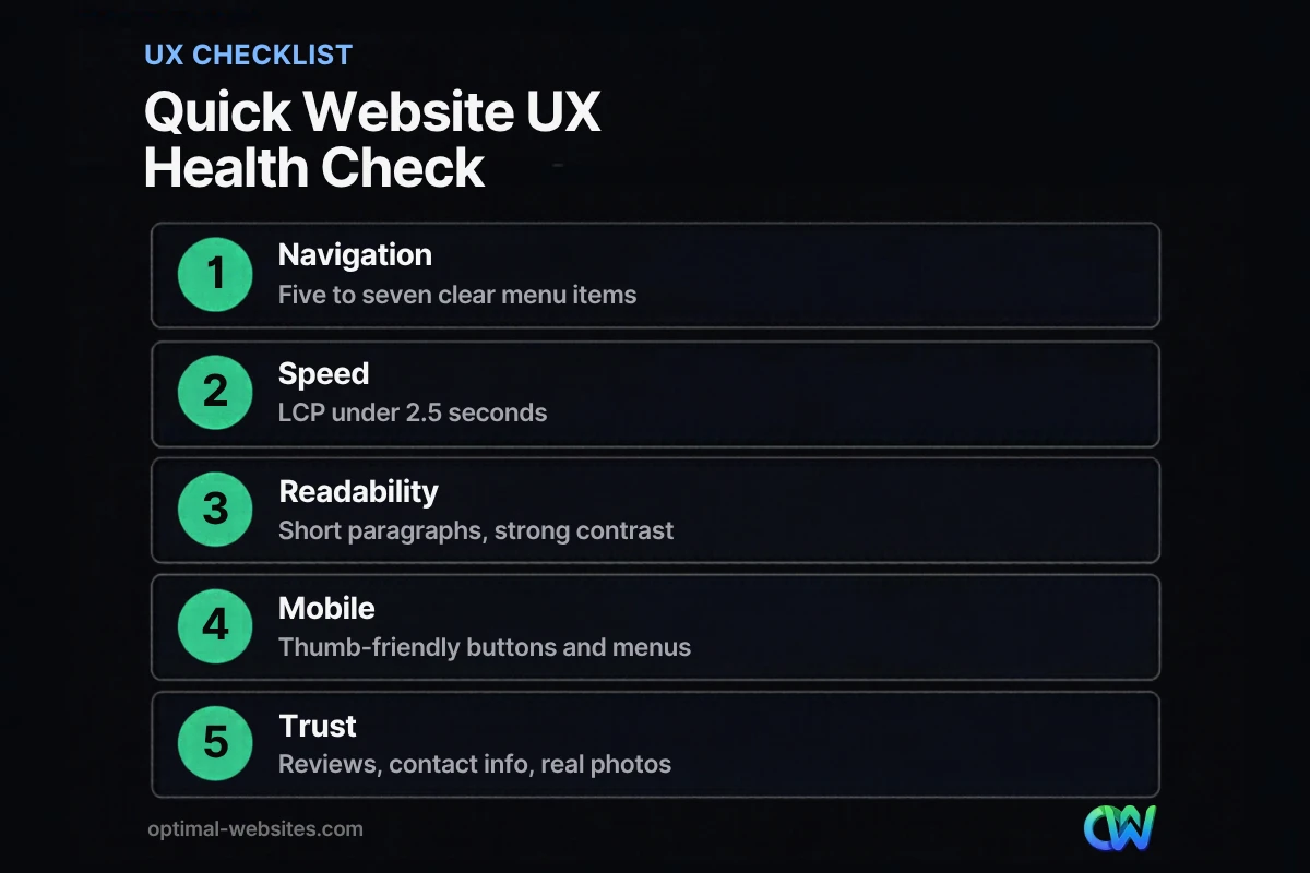
A website UX checklist should cover the basics a visitor notices in the first visit: clarity, speed, readability, mobile usability, forms and trust. Use this one for a quick audit.
- [ ] Homepage headline says what you do and where, in one sentence
- [ ] Main menu has five to seven clear items
- [ ] Phone number and primary CTA are visible on every page
- [ ] LCP is 2.5 seconds or less on mobile in PageSpeed Insights
- [ ] Layout does not jump while loading (CLS 0.1 or less)
- [ ] Buttons and links respond quickly to taps (INP 200 ms or less)
- [ ] Body text is at least 16px with strong contrast
- [ ] Paragraphs are short and pages use descriptive headings
- [ ] No autoplay audio and no pop-ups covering content on mobile
- [ ] Forms ask only for essential fields and show clear errors
- [ ] Reviews, real photos and contact details are easy to find
- [ ] Content, service pages and copyright year are current
- [ ] Every key page has been tested on a real phone
How do usability principles guide better UX decisions?
Usability principles give you a reliable way to judge design choices instead of relying on taste. Nielsen Norman Group’s 10 usability heuristics are the most widely used set.
A few translate directly to small business websites:
- Visibility of system status: confirm form submissions with a clear thank-you message.
- Consistency and standards: keep buttons, colors and menu placement the same on every page.
- Error prevention: use input formats and helper text so people get forms right the first time.
- Recognition rather than recall: show options and information instead of making visitors remember them.
- Aesthetic and minimalist design: remove anything that does not help the visitor decide.
“Boring” design is not about lacking decoration. It is usually a sign that the page has no clear hierarchy, no real photos and no reason to keep scrolling. Strong visuals of your actual team and projects fix that better than stock clichés.
How often should I update my website for a better user experience?
Review your site’s UX at least once a quarter and update content whenever your services, pricing or contact details change. Infrequent updates make a site feel abandoned, which erodes trust.
At Optimal Websites, a WordPress web design agency based in Delaware, we build mobile-first sites in WordPress with Elementor Pro for contractors, roofers, law firms and local service businesses. A pattern we see often: the best-performing sites are not the flashiest, but the ones where the owner can easily keep content fresh. That is why we include video tutorials so clients can edit their own pages, and why it helps to know the pages every business website needs before you plan updates.
Small, steady improvements compound. Fix the biggest friction point, measure the result, then move to the next one. Combined with clear calls to action, that process is the most dependable path to turning more visitors into leads.
How Optimal Websites Can Help
If your site is getting visitors but not enough calls or quote requests, the problem is often UX rather than traffic. Our team offers professional web design and development focused on fast, mobile-first, conversion-focused WordPress sites built with Elementor Pro. Most projects launch in 2–4 weeks, and you can see our website packages and pricing to find the right fit, starting at $999.
Frequently Asked Questions
What are the best website user experience tips for small businesses?
The best website user experience tips for small businesses are clear navigation, fast mobile loading, scannable content, visible contact options, short forms and genuine reviews. These fixes address the most common reasons visitors leave. Start with your homepage and top service pages, since they receive the most traffic and have the biggest impact on calls and quote requests.
How does user experience affect SEO?
User experience supports SEO because Google confirms that Core Web Vitals are used by its ranking systems, and its page experience guidance also covers mobile display, HTTPS and avoiding intrusive interstitials. Good UX also keeps visitors engaged once they arrive. Relevant, well-structured content that answers the searcher’s question helps both rankings and conversions at the same time.
What causes a high bounce rate on a website?
A high bounce rate usually comes from slow loading, confusing navigation, content that does not match the search, poor mobile layouts or intrusive pop-ups and autoplay media. Sometimes it is fine, such as when a visitor finds your phone number and calls. Look at bounce or engagement rate alongside conversions to judge whether a page truly has a problem.
How can I improve website user experience without a redesign?
You can improve website user experience without a redesign by compressing images, simplifying your menu, shortening forms, increasing font size and contrast, removing intrusive pop-ups and rewriting headlines to answer the visitor’s question right away. These changes are low cost and often produce noticeable gains. A redesign makes sense when the site’s structure or platform blocks these fixes.
What tools can I use to test my website’s UX?
Free tools cover most needs. PageSpeed Insights reports Core Web Vitals, Google Search Console shows search performance and a Core Web Vitals report, and Google Analytics 4 tracks engagement and conversions by page and device. Pair them with simple user testing: ask a few customers or friends to complete a task, such as requesting a quote, while you watch.
How long does it take to improve a website’s user experience?
Quick wins like image compression, menu cleanup and form simplification can be done in days. A full mobile-first rebuild with new structure and content typically takes a few weeks; at Optimal Websites, most projects launch in 2–4 weeks. Ongoing UX improvement never really ends, so plan regular reviews to keep the site fast, current and easy to use.
Ready to Get Started?
Want a website that is easy to use and built to convert? Request your free quote or call us at (302) 554-9497 to talk through your goals.